The Time Spent Studying Out of School
An Explanatory Data Visualization From PISA Data Set
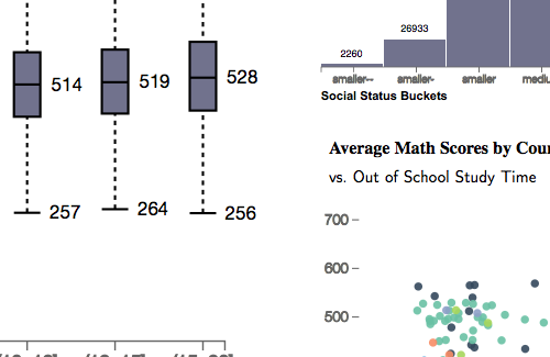
Here I created an explanatory data visualization from PISA data set exploring the correlation between the time spent studying outside the school and the math scores from almost 500,000 students all over the world. I used some personal data to introduce the study =).
The visualization is in the walk-through format, with the ability to explore allowed at the end. I used javascript, D3.js library, and bootstrap. I cleaned and wrangled the data using Python libraries. This project is connected to the Data Visualization course, from Udacity.